

Mic Data 2: Frequency Response & Sound
Frequency response is perhaps the most popular specification, because it relates to what’s most important to all of us: sound. But can it accurately describe ‘sound’?
24 July 2020
WHAT A RESPONSE CURVE CAN TELL YOU – AND WHAT IT WON’T
Generally, mere figures like “20 Hz – 20 kHz” are not very useful. A frequency response diagram will give you much more information, because it illustrates the microphone’s sound balance. For instance, if you see a rise in the upper frequencies of, say, 6 dB, you can expect the respective microphone to sound quite bright. However, a frequency response plot won’t tell you if you are going to like the character or “texture” of this brightness, whether it will sound silky or harsh to your ears.

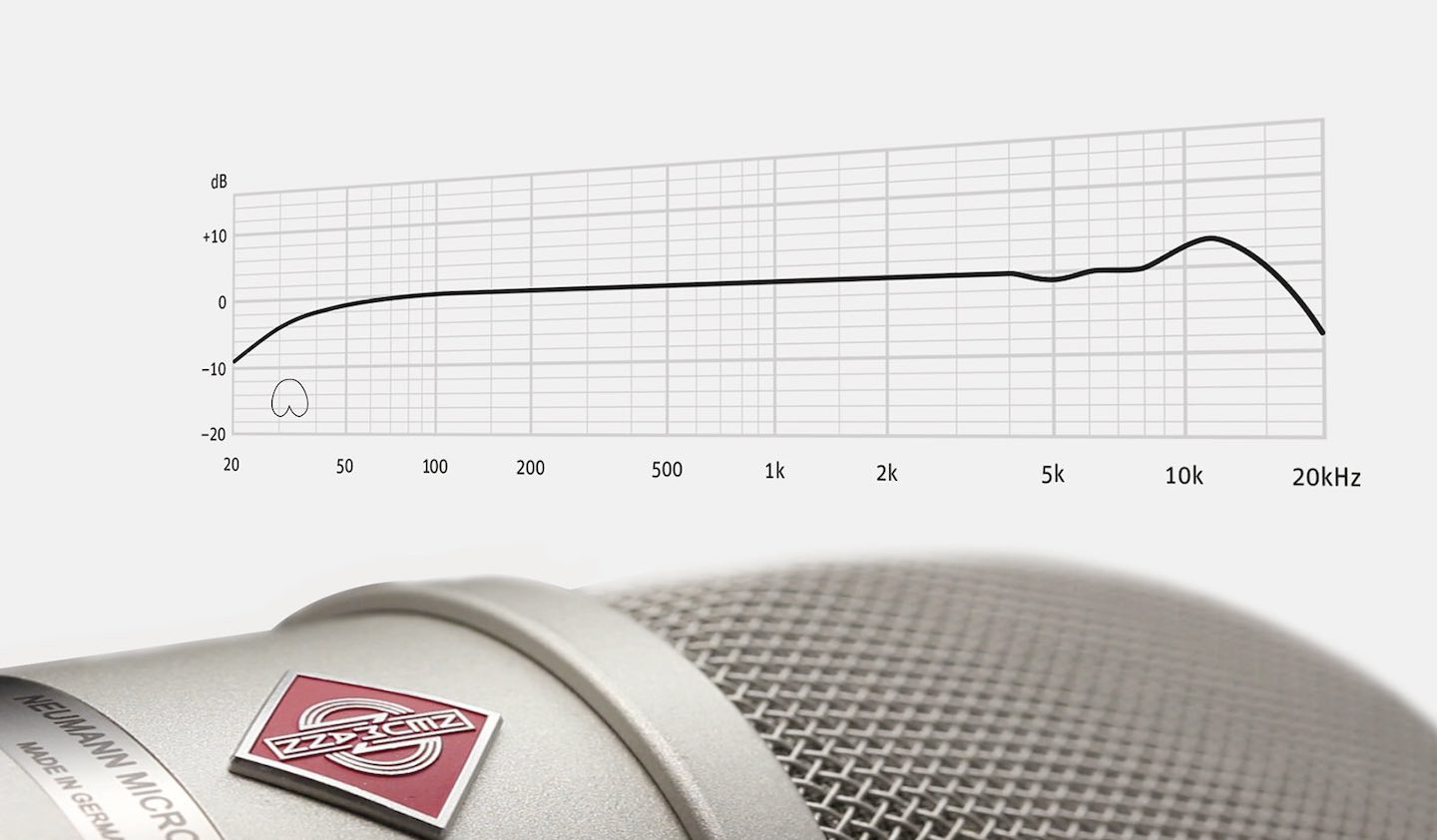
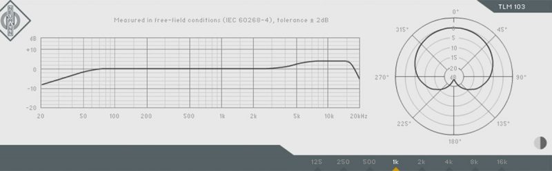 The Neumann TLM 103 large diaphragm microphone shapes the sound with a broad presence boost.
HOW TO READ A FREQUENCY DIAGRAM
Let’s look at the X-axis: The frequencies are usually displayed on a logarithmic scale, which is closer to human perception than a linear scale. You might say, the logarithmic scale is spaced in octaves (which you get by doubling the frequency): the distance from 100 Hz to 200 Hz is just as wide as from 1000 Hz to 2000 Hz or from 10,000 Hz to 20,000 Hz.
Just to give you a rough idea of the various frequency ranges:
Below 40 Hz: Sub Bass. Apart from kick drum, the sub bass range contains little musical information.
40-200 Hz: Bass frequencies, the foundation. The lowest note of a 4-string bass is about 40 Hz, the lowest note on a guitar is about 80 Hz. The lowest note of a male singer (baritone) is about 100 Hz, although you rarely hear such low notes. Well, maybe from country singers. Most pop singing by men and women is above 150 Hz.
200-500 Hz: Low Mids. This is the “body” of most instruments. This is also where the human voice has most of its energy.
500-3000 Hz: Mid Range. This area is crucial for the sound character, because it’s where the human ear is most sensitive to even the smallest details. The telephone transmits little below or above this range, yet we are able to recognize callers by their “hello.”
3000-7000 Hz: Presence. This range is important for sound definition and good intelligibility. It is the area of many speech consonants.
7000-14000 Hz: Treble. This area is crucial for our sense of brightness. However, too much energy in this area can sound harsh and distracting. This is the area of speech sounds such as S and T, of cymbals, but also of string noises.
Above 14,000 Hz: Air band. This area is important for recordings that want to sound “expensive” and “super-hi-fi.” It gives voices and stringed instruments an airy feel, hence the name. It does not contain much musical information, though.
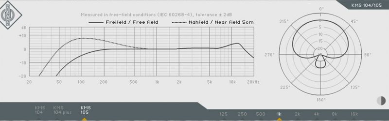
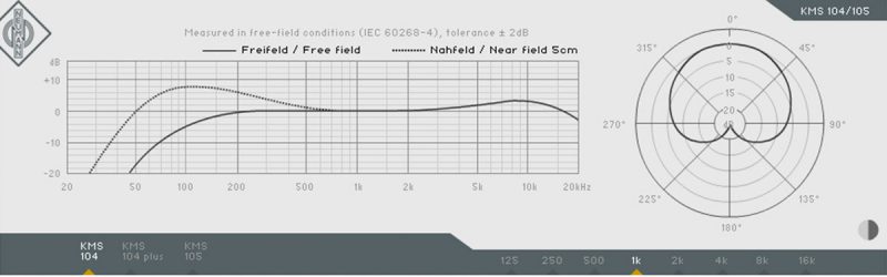 The presence boost of the Neumann KMS 104 (above) is a bit wider than that of the KMS 105 (below).
Comparing Frequency Diagrams
When you compare frequency plots, always take note of the how the Y-axis is scaled. Some manufacturers use a very wide scale to make a jagged frequency response look nice and smooth. Also, some less reputable manufacturers more or less make up their frequency plots, as they don’t own the necessary gear. An anechoic room and measurement equipment are quite an investment; a pencil is so much cheaper!
Typically, a studio microphone is more balanced than a stage mic, but not exactly linear, either. Most microphones show a rise in the upper frequencies, .i.e. in the presence and treble regions. While frequency diagrams could be helpful, for instance to compare the location and magnitude of those boost frequencies, the published charts are often unreliable or mere wishful thinking, especially on lower end products.
Tutorial Courtesy of Neumann: www.neumann.com


RESPONSES